6
$\begingroup$

A friend of mine, who is a student in the area of Brand Marketing, sent me an e-mail:

Hey

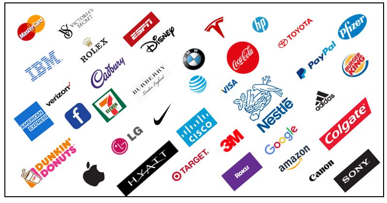
I am working on a a Class Project that relates to Logos and Brands- what makes them so attractive. I have created a collage of several Trade Marked logos (by cut and paste from the Net) and product brands of various companies in a slide. I think these are some of the most recognizable brands and logos in the world. Any comments?

I looked at his slide. Here was my response

I don't know how you brought these all together but I see 3 wrong things with your slide. And you are the expert, so tell me what they are. It has nothing to do with: the individual proportions (length,width etc.) of the logo, or the colors, or the background or where they are placed or if they are crooked wrt to other logos or they are current logos or not or if there is Registered Trademark symbol on these logo or not. The 3 errors are simple.

Can you figure it out?

No partial answers please.

logos

$\endgroup$
3
  • $\begingroup$ Who recognizes the red pointed logo $\endgroup$
    – Amoz
    Commented Aug 5, 2021 at 1:05
  • $\begingroup$ I have 2 but don't recognize it (probably my error) but that implies to me it's the 3rd error as it's supposed to be "one of the most recognizable logos in the world"??? Or do I just not shop at this store, whatever it is... $\endgroup$
    – Amoz
    Commented Aug 5, 2021 at 1:29
  • $\begingroup$ n/m kind user pointed out it's Tesla. Back to the drawing board for #3 $\endgroup$
    – Amoz
    Commented Aug 5, 2021 at 2:05

5 Answers 5

14
$\begingroup$

I see three errors in the logos:

1. Seven Eleven should end in a lowercase 'n'.

2. Nestle has the accent mark facing the wrong direction. Viewer might call it nestel instead of nestlee.

3. The logo for Canon should have an iconic tilted 'O'. Here the O appears to be normal type. In the past the O was non-tilted, but the other letters would have also changed, whereas here as best I can tell, the rest of the logo is in its modern typeface.

$\endgroup$
1
  • $\begingroup$ You know? rot13(V qba'g guvax V rire ertvfgrerq gung guvat bire gur 'r' va Arfgyr nf na npprag znex. Vg ybbxf whfg yvxr n pbagvahngvba bs gur yvar nggnpurq gb gur 'A'...) $\endgroup$ Commented Aug 5, 2021 at 13:55
3
$\begingroup$

I see 3 wrong things

… in the e-mail message. The word "a" is repeated ("working on a a Class Project"); the capitalization is incorrect ("Logos", "Brands", etc.); and the spacing is incorrect (the dash has a space after it but not before it, and "trademarked" has an extra space in the middle).

$\endgroup$
1
  • 1
    $\begingroup$ I am sorry but it has everything to do with actual logos and not the e mail $\endgroup$
    – DrD
    Commented Aug 4, 2021 at 21:55
2
$\begingroup$

A meant mininuscule mistake is that the letters in three words

do not start with one upper case followed by lower case or are not all upper or lower case.

The three logos are

ESPn
DiSNEY
ROKu

$\endgroup$
1
  • 1
    $\begingroup$ While that is an astute observation @Tom, I was talking about 3 errors. $\endgroup$
    – DrD
    Commented Aug 4, 2021 at 22:48
1
$\begingroup$

1. The MasterCard logo is old.
2. The Facebook logo is not actually their logo (the letter 'f' should be off-centre, to name one difference).
3. The accent on e in Nestlé is facing the wrong way.

$\endgroup$
1
  • 1
    $\begingroup$ Hello @Szymon Lopaciuk. Welcome to PSE. The puzzle text says that the errors are not related to the fact "they are current logos or not". Thanks $\endgroup$
    – DrD
    Commented Aug 5, 2021 at 15:44
0
$\begingroup$

Coca-cola: The shape looks a little more oval than I'm used to seeing

Facebook: This logo is old, the new one has a lighter shade of blue

Roku: Is this the right colors?

$\endgroup$
1
  • $\begingroup$ The question explicitly says that it doesn't matter how old the logos are, and there's already a highly voted accepted answer which has the correct differences, none of which you have identified. Please only add new answers after the correct one has been accepted IF you are adding sufficient value. $\endgroup$
    – bobble
    Commented Aug 9, 2021 at 19:13

Your Answer

By clicking “Post Your Answer”, you agree to our terms of service and acknowledge you have read our privacy policy.

Not the answer you're looking for? Browse other questions tagged or ask your own question.