1
$\begingroup$

A friend of mine is a professor at a nearby university. Last week, he gave three of his students a simple assignment: conduct an experiment (all three of them separately and independently from each other), and record the development of a single value over time. And indeed, a few days later, all of them handed him a diagram, as seen below (here edited into a single image): Line diagram with three rows of data, blue, red, and yellow
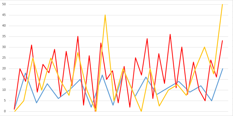
This came as a bit of a surprise for my friend. All three students were known to be incredibly lazy, and he half expected that least one of them spent his time drinking, gaming, watching TV or doing something else not work-related. Could it be that they took their assignments seriously this time? They would not just make up a few data points - would they? Although he coulnd not quite put his finger on it, my friend knew that there was something wrong with this data. Someone is going to be in trouble for this.

So, can you tell me who my friend will order into his office tomorrow?
Student 1 (Blue line)?
Student 2 (Red line)?
Student 3 (Yellow line)?
Or even more than one of them?

A few clarifications:

  • All three students performed the same experiment, but separately from each other. The different number of data points, different starting values, all-integer-values (except for student 3) are all normal for this experiment and not reasons to suspect foul play.

  • All data values are integers, except for yellow, who has a few .5-values. Again, something that can happen in this experiment.

  • As you have already noticed, student 1 has all numbers from 1 - 20 in his results. That is somewhat unlikely, but not impossible in the experiment. Now if he had 1 - 20 in ascending order, that would be a reason to call him in.

  • This has nothing to do with statistics. Rather, all suspect lines follow a specific, but not too obvious pattern that screams "I was copied from somewhere".

Hints:
Student 1 is 21 and British.
Student 2 is 25 and from a rich family with French roots.
Student 3 is 52 and American.

$\endgroup$
24
  • 22
    $\begingroup$ Answer: All of them. You shouldn't report a discrete set of data points as a line chart without markers showing the data points. Now it's impossible to tell whether there are data points that happen to lie exactly on the line between the adjacent data points. $\endgroup$
    – JiK
    Commented May 6, 2016 at 16:09
  • 11
    $\begingroup$ The graph is meaningless. I would call the professor in for making decisions on data that has no information in it. $\endgroup$
    – Aron
    Commented May 6, 2016 at 17:26
  • 6
    $\begingroup$ Can you transcribe the values? I can't quite tell what some of them are. $\endgroup$
    – Deusovi
    Commented May 6, 2016 at 17:30
  • 7
    $\begingroup$ Did you actually perform an experiment to produce any of this data, or did you just make it all up? Are we supposed to be distinguishing actually-fabricated data from actually-real data, or are we supposed to be distinguishing data fabricated to look fabricated from data fabricated to not look fabricated? $\endgroup$ Commented May 6, 2016 at 18:03
  • 11
    $\begingroup$ This seems like a "Guess what I'm thinking" puzzle and should probably be put on hold until it is improved. $\endgroup$ Commented May 6, 2016 at 21:34

14 Answers 14

19
$\begingroup$

He calls in

Red and Blue

because

Red's values are every integer from 0 to 36, with no repeats. Blue's are 1 through 20. This is very unlikely to be the result of chance.

Because OP says that isn't a good enough reason:

Red's values are the numbers on a roulette wheel, and Blue's are the numbers on a dartboard.

$\endgroup$
5
  • 2
    $\begingroup$ Good observation (you should take another look at red, though), but not there are still a few things missing. Unlikely is still not Impossible. $\endgroup$
    – cpj
    Commented May 6, 2016 at 14:49
  • 4
    $\begingroup$ @cpj Not to quibble, but technically no graph can be impossible. Proof: Say that the method to which they are measuring the value is "cursed" (within error bounds) to always return the values in the graph for those experiments. Then even honest students will show the graph, whatever it is. Hence, I think it likely you actually are asking us to find what is unlikely (but not necessarily impossible.) However, if you are so sure we can determine the graph as truly impossible then the solution must require some lateral thinking that works around my above argument. $\endgroup$ Commented May 6, 2016 at 17:35
  • $\begingroup$ Technically Red has all values from 0 to 36. $\endgroup$
    – ruudvan
    Commented May 6, 2016 at 18:00
  • $\begingroup$ @cpj We could also say that there's no way the no. of intervals(36 or 20) could be a max bound for the values that the person gets, so raises a red flag(assuming, of course, that the experiment is not designed that way). $\endgroup$
    – cst1992
    Commented May 9, 2016 at 12:44
  • $\begingroup$ Now we are going somewhere! What about yellow, anywhere he could have copied his values? $\endgroup$
    – cpj
    Commented May 9, 2016 at 12:47
9
$\begingroup$

He calls in

All of them

because

A single value doesn't change over time

$\endgroup$
8
$\begingroup$

NEW ANSWER

Blue will be called in

because

Blue's line only alternates between up and down, whereas both other lines go the same direction twice at least once.

but

this is kind of arbitrary.

$\endgroup$
5
  • $\begingroup$ The line is just behind the others. If you zoom in on the image you can still see the blue line $\endgroup$
    – user20864
    Commented May 6, 2016 at 13:42
  • $\begingroup$ @rlord3534 Yeah, I guess there's a tiny sliver of blue there where the "undersides" of the red and yellow come together $\endgroup$ Commented May 6, 2016 at 13:43
  • $\begingroup$ The three experiments were conducted independently from each other, they did not necessarily measure in the same intervals. I'll edit the question for clarity. $\endgroup$
    – cpj
    Commented May 6, 2016 at 13:52
  • $\begingroup$ Doesn't seem arbitrary that's highly suspicious $\endgroup$ Commented May 6, 2016 at 14:34
  • 1
    $\begingroup$ @BenjaminBraun With so few data points, and the fact that both other sets of points don't "double" in the same direction, it seems arbitrary to me. $\endgroup$ Commented May 6, 2016 at 14:36
8
$\begingroup$

Red

Because

The red line's data points are all uniformly distant horizontally.
Both blue and yellow have data points that are a little further apart than others, suggesting they weren't able to measure the value at exactly the same time interval every time. That Red was apparently able to do this suggests he "made up" at least some of the data. That all three were known to be lazy lends further support.

$\endgroup$
5
$\begingroup$

PARTIAL OBSERVATION (not a full solution)

According to the recent edits to the problem, it is impossible for the experiment to produce the results 1,2,3,...20 but it is possible for the experiment to produce the numbers 1 through 20 in any other(?) order. This means that there is some meaning in the sequence, since that meaning must be invalidated by the ascending order. I would advise looking at this as a lateral thinking puzzle, perhaps somehow translate the sequences into text and try to read a message from each student's values?

Old solution which is not correct:

He will call in

Yellow

Since

Their values are all multiples of 2.5, which is unlikely to be correct

$\endgroup$
14
  • $\begingroup$ There are definitely some values that don't fit that criterion $\endgroup$ Commented May 6, 2016 at 13:45
  • $\begingroup$ No I just double checked. You may be falling for an optional illusion where the line dips down for a value and then spikes up and the line due to rendering issues doesnt ever actually touch the data point. Also fine there are enough points where the condition holds that the student is probably fabricating numbers. $\endgroup$ Commented May 6, 2016 at 13:48
  • $\begingroup$ Well no - look at the second-lowest point that yellow reaches - whatever that is, it's $2.5 < x < 5$ $\endgroup$ Commented May 6, 2016 at 13:49
  • $\begingroup$ Actually, he is right about the values of the yellow line. Not the correct answer, though. $\endgroup$
    – cpj
    Commented May 6, 2016 at 13:50
  • $\begingroup$ @question Looks like 2.5 to me. $\endgroup$ Commented May 6, 2016 at 13:51
3
$\begingroup$

Well... I see two options

1.

Yellow and blue

because

Both have the exact same number of peaks at similar intervals, while red has twice as many, making it more likely that one of them attempted to duplicate the other's work.

2.

This is a different take on my first answer.

Red

because

He would call in Red because he has recorded almost double the datapoints as the other two. Assuming they're recording the same value, it's odd he would have twice the data points.

$\endgroup$
2
$\begingroup$

Yellow

because

Yellow's last data point is undefined

$\endgroup$
2
$\begingroup$

He calls in

Yellow

Because

Yellow's data has three zeroes in it, and it also starts at zero, which could be impossible. For example, suppose the data is the population of some small insect or germ in a test environment. If the population ever hit zero, then it would stay zero, since there would be none of the population left to reproduce and build the population back up again. Or, the data could be how much food, air, water, etc. is consumed by a process or lifeform, and once the consumption hits zero, the process or lifeform would stop or die, making it impossible for consumption to increase after that.

$\endgroup$
1
  • 2
    $\begingroup$ If you're showing change, isn't the first value undefined and not zero? (If there is no -1'th element I can't define the change from -1 to element 0. Showing 0 in this case might well be a convention, I don't know. $\endgroup$ Commented May 6, 2016 at 17:55
2
$\begingroup$

He calls in

Student 2 for the red line

after considering the results of all three, because

given they were all doing the same experiment, their data should show generally the same pattern.

Blue and yellow show generally the same pattern of rising and falling on the Y axis as we look across conditions in the X axis. Red's values are all over the place however, sometimes in disagreement with the observations of Blue and Yellow.

$\endgroup$
2
$\begingroup$

This is another answer based on the fourth clarification and your comment

The graph is not strictly necessary, but just listing the values would probably make it far too easy

It seems this was also the reason on the graphs being superimposed, instead of side-by-side.

I tried to predict the values, and here they are:

Blue:

1 17 4 13 6 15 3 17 3 20 13 16 7 16 8 14 9 12 5 20

Red:

20 14 32 9 22 18 29 7 28 12 35 3 26 0 32 15 19 4 21 2 25 17 34 6 27 13 36 11 30 8 23 10 5 24 16 33

Yellow:

0 5 25 10 25 13 27 0 45 5 20 0 20 3.5 10 12.5 8 30 17 50

Based on these data, the obvious suspect seems to be

Yellow

Because:

Most of the values are rounds: 0, 5, 25,... which will make a "pretty" graph, but most probably not an accurate one. Yellow threw in some .5 values to make it look genuine.

This is a trick many rookie copiers try, but it fails every time - they underestimate the professor :)

$\endgroup$
1
  • $\begingroup$ Most of the values for blue and red are correct, but not all of them - you missed a few points where the line does not make a sharp turn. Also, remember that we already established that red and blue do not have any repeated numbers. Still, I was able to google parts of the answer from what you got right. $\endgroup$
    – cpj
    Commented May 9, 2016 at 10:40
1
$\begingroup$

My answer depends on an ambiguous point in the original post

Either

Yellow

because

His initial data point is different from the other two (if they were all given the same value to start with)

or

Red & Blue

because

Their initial data points are identical (if they were all given different values to start with)

$\endgroup$
1
  • $\begingroup$ No, that has nothing to do with it. I'll give a few clarifications in a minute. $\endgroup$
    – cpj
    Commented May 6, 2016 at 17:27
1
$\begingroup$

He calls in

Red.

Why?

Red has more data points than blue or yellow. He's made some of them up (based on the assumption the professor is right about his students being lazy).

$\endgroup$
1
$\begingroup$

He calls in

Red.

Because...

Red's results are too uniform in amplitude and frequency. True random numbers have much larger variations in both. Especially since truly random numbers have repeating values, but humans who are choosing numbers "randomly" tend to avoid repetitions.

$\endgroup$
0
$\begingroup$

I'll add a new point no one has yet raised based on a clue in the puzzle:

The professor calls in

Student 2(red line).

Reasons:
1.

The data seems to be related to the age somehow. Why otherwise would someone want to tell the person's age to the puzzle solver? The age has to be related to the data, in a way that cannot be altered. Or, if this seems to be too far-fetched a claim, at least the last data point.

2.

The person is the only one given from a rich family, so he most likely paid someone to gather the data for him. Or didn't value the education was getting, and copied the data without understanding what it means.

Based on this, in the data:

The real data-gatherer must be around 33-34 years of age. Red is the only one which the last point doesn't correspond to the candidate's real age.

I'm not sure about the nationalities, though. Maybe the ways the universities work?

$\endgroup$
3
  • $\begingroup$ No, sorry. Nobody paid anyone to gather data for them. The "ages and nationalities"-hint is a clue about what they did instead of work - there is another hint about that in the text that nobody seems to have noticed yet. $\endgroup$
    – cpj
    Commented May 9, 2016 at 8:04
  • $\begingroup$ Would it help if you provided all data values for everyone numerically below the graph? I think that plays a role. $\endgroup$
    – cst1992
    Commented May 9, 2016 at 8:10
  • $\begingroup$ Yes it does. It would also defeat the purpose of the graph ;) Also, f'' has already found the values of the red and blue line, it shouldn't be that hard. $\endgroup$
    – cpj
    Commented May 9, 2016 at 8:18

Not the answer you're looking for? Browse other questions tagged or ask your own question.